Here we look at how to use HighCharts with Spark. HighCharts is a charting framework written in JavaScript. It works with both static and streaming data. So you can make live charts with it. And their collection of charts is a beautiful set of designs, made larger by the annual competition they hold.
HighCharts is free for non-commercial use. It is difficult to master unless you are a JavaScript programmer, so these people have written a framework around it, called spark-highcharts.
One problem with that framework is that there is hardly any documentation. All they provide beyond a couple of examples are JavaDocs. So you could bounce back and forth between that and the HighCharts documentation. If you use it, send them an email and let them know that their community of users is growing. Certainly what they and HighCharts offer are far more options that are built into Zeppelin.
You will also want to study graph styles, as knowing about the different types of charts and the concepts behind them is probably more difficult than writing code to use them. For example, do you know what is a funnel series?
(This tutorial is part of our Apache Spark Guide. Use the right-hand menu to navigate.)
HighCharts and Zeppelin
You can use HighCharts in web pages, with spark-shell, and with Zeppelin. Here we use it with Zeppelin.
You can use this Docker command to download and a Zeppelin bundle with HighCharts already installed:
docker run -p 8080:8080 -d knockdata/zeppelin-highcharts
And use this to stop all Docker containers when done. But export your work as a JSON file first as it will be lost when you do that:
docker stop $(docker ps -aq)
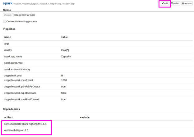
The other alternative is to add these artifacts to the Zeppelin Spark interpreter for Zeppelin that you already have installed. What you are telling Zeppelin here is to reach out to Maven Central and download the Java code you need to make HighCharts work. (Plus it requires lift-json).

Create a simple chart
I am not expert on creating aesthetically pleasing charts, yet. So below we make a simple series, i.e., a chart with an x and y axis.
The code is clear enough and is the same we used to explain how to use Zeppelin and Spark here. We convert all the double to integers and then group them to have only a few data points of simple numbers. Otherwise the chart is too crowded and difficult to read.
import com.knockdata.spark.highcharts._
import com.knockdata.spark.highcharts.model._
import org.apache.spark.sql.types._
import org.apache.commons.io.IOUtils
import java.net.URL
import java.nio.charset.Charset
val data = sc.parallelize(
IOUtils.toString(
new URL("https://raw.githubusercontent.com/cloudera/spark/master/mllib/data/ridge-data/lpsa.data"),
Charset.forName("utf8")).split("\n"))
val schemaStr = "a b c d e"
val fields = schemaStr.split(" ").map(fieldName => StructField(fieldName, DoubleType, nullable = true))
val schema = StructType(fields)
val parsedData = data.map( l => l.replace(",", " ").split(" "))
def toIntSql(i: Double) : Int = { i.toInt }
case class DataClass(a: Double, b: Double, c: Double, d: Double, e: Double)
ar x = parsedData.map(b => DataClass( toIntSql(b(0).toDouble),  toIntSql(b(1).toDouble),  toIntSql(b(2).toDouble),  toIntSql(b(3).toDouble),  toIntSql(b(4).toDouble)))
var df = x.toDF()
df.createOrReplaceTempView(df")
var g = spark.sql("select a, b from df group by a , b")
The charting section, shown below, is fairly self-explanatory. What it shows is that the HighCharts works with data frames, not SQL temporary tables. The arguments you give depend on the chart type. Like we said, the documentation is sparse, but you could look at the spark-highcharts JavaDoc for the series chart here and definition of a series charts by HighCharts here.
highcharts(g
.series("x" -> "a", "y" -> "b")
.orderBy(col("a"))).plot()
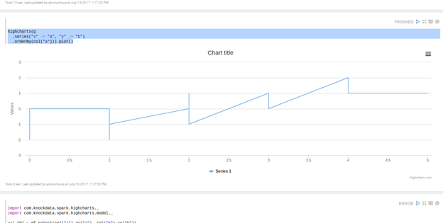
Here is our simple chart of x and y where x is the column a in the dataframe and y is the column b. Since it is a series, the x axis should be sorted.


