
Look on Stack Overflow for how to plot multiple lines on a line chart in Tableau Online and you will turn away frustrated. Perhaps you can do two. Perhaps you can do three, if you also use the right-hand axis. Most instructions you find are for Tableau Desktop. But Salesforce has bought Tableau, so online is where you need.
In this article, I show how to plot as many lines you want on a Tableau chart.
(This is part of our series on Tableau and assumes you have a basic understanding of the program. If not, you can start with Tableau: Getting Started with Real Examples or Tableau for Finance: How To Join Tables, Write Calculations, and Analyze Finances, among others.)
(This article is part of our Tableau Online Guide. Use the right-hand menu to navigate.)
Use case: Sales by employee by date
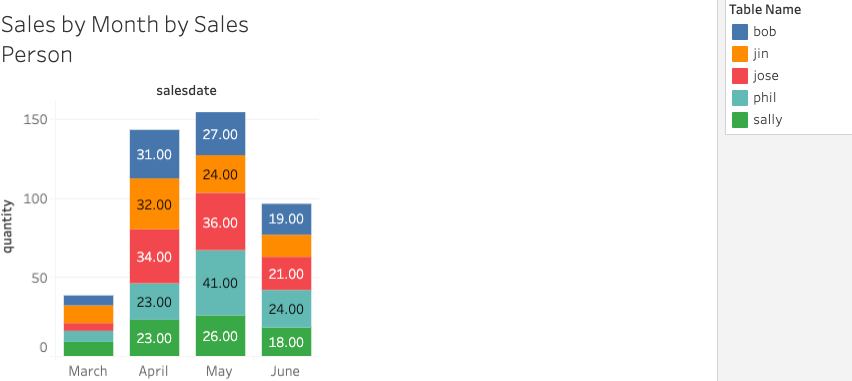
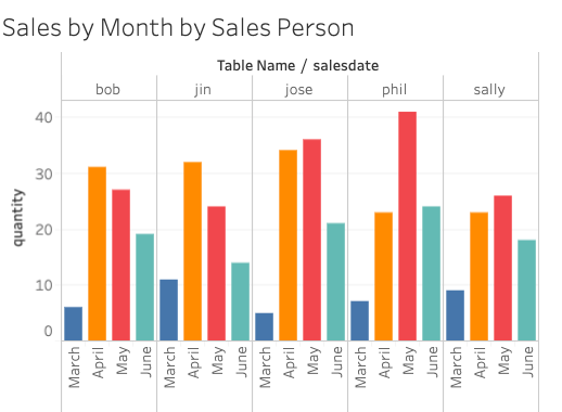
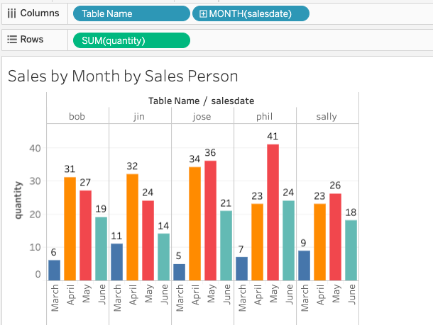
Look at this chart. This is three dimensions. If you were to take the normal approach to plotting this data, it would create separate charts for each employee. That’s not a good way to show how one metric relates to another, since it’s on a different chart. Stacking all the data onto one chart is easier to see.

To follow this tutorial, download and run this Python code. Then, create this table:
create table sales (
salesperson varchar(50),
product varchar(50),
quantity numeric,
salesdate date);
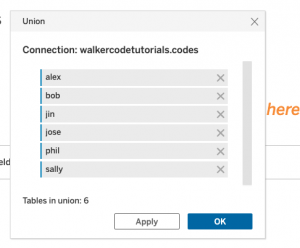
Next, create a separate view for each of the salespeople (they are listed in the code) like this:
create view bob as select * from sales where salesperson = 'Bob';
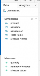
Now create a union in the data source screen in the worksheet. Drop each view onto the union. A union is all of the data sets (views in this case) added together.
Now create the worksheet:
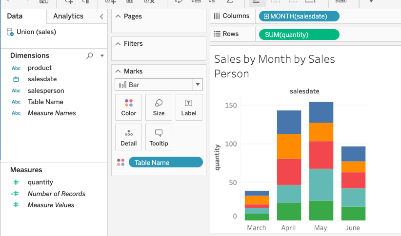
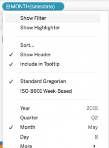
Change the saledate to group by month:
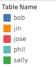
Drop the table name on the color mark.
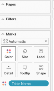
This assigns a different color to each view and creates a legend to the right.
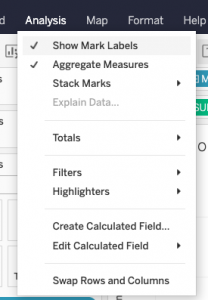
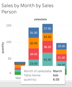
Select Show mark labels so you can see the numbers.
Here is a closer view:
And zooming in further:
Creating different charts in Tableau
Now we can play around and select the Show me tab on the right and create different kinds of charts.
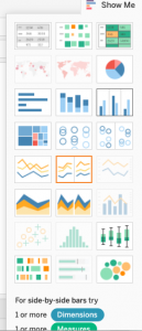
We need to have one or more dimensions and one or more measures. Remember dimensions are items you can do math calculations on (e.g., sales), and measures you cannot (e.g., table name and dates).
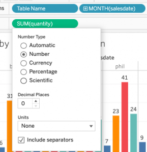
To remove decimal points, do this:
Here is a different chart:
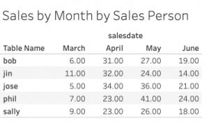
This is your data in a text table:
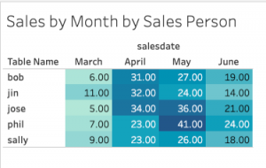
The same, but with the darling colors of a heat map (This is not a heat map, not exactly.)
These postings are my own and do not necessarily represent BMC's position, strategies, or opinion.
See an error or have a suggestion? Please let us know by emailing blogs@bmc.com.