Continuing our series on Tableau, here we explore two important components: how to calculate covariance and correlation and how to use the trend line.
We want to answer: “To what extent is the stock price positively correlated with earning?” That answer, as most people who follow the stock market know, is somewhat. Let’s get started.
(This article is part of our Tableau Online Guide. Use the right-hand menu to navigate.)
Data for Tableau
We will use the same financial data that we used in our last Tableau tutorial: the stock prices, earnings, and dividends for Starbucks, Johnson & Johnson, and Disney. We will pick just one company, the J&J stock price. To simplify things (meaning: avoid having to join two tables and collapse one of them), we will get the stock prices from their quarterly reports instead of using the stock price data.
Understanding correlation and covariance
Correlation means a change in one component or area causes an equal increase in the other. The change may be positive or negative. Covariance measures how those variables change together, but it can scale to any number, making it difficult to understand.
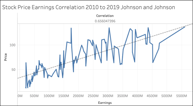
Here we use stock price and earnings. We create a line chart of the quarter ending date against the price column. The correlation is shown to the left. This is the CORR function. We say that two items are positively correlated when this value is 1.
The value in our graph is 0.65, which indicates some but not very strong correlation. It would not make sense to plot the correlation value across the whole chart, since it’s a single number. So, Tableau shows the one number.
Plotting and using a trend line
Basically, a trend line will reaffirm what we observation from the correlation value. Think of this line in terms of linear regression: It is the line that most neatly slices the data points down the middle.
To add a trend line to your chart, pick the trend line from the worksheet design screen on the analytics tab. This adds a dashed line between the points on the plot line.
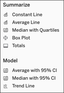
Since this is a XY plot (i.e., the line y = mx + b), if you hover the mouse over the trend line, Tableau shows you:
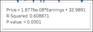
In this case:
- y (price) is the dependent value
- Earnings is the independent value
- 9 is the value b
- The y intercept, the point where x crosses the vertical (y) axis
- m is the slope of the line y = mx + b or 0.0000000187
- Price = (0.0000000187 * earnings) + 32.9
There are various types of trend lines. This one shows additional information:
- R-squared = 0.608871 means the variation in price given variance in the earnings. As you can see it’s almost the same value as the correlation—which is what we would expect.
- P-value < 0.0001 is a test of the null hypotheses. It tests whether there is no relationship between price and earnings. Clearly, they are related, as the P-value is a small number.
Disabling aggregation
Tableau always assumes you want to do aggregation. So, it adds the function SUM() to add numeric values and uses the YEAR() function on dates.
This is annoying behavior when you want to do a scatter or line chart. To use individual values and not the sum, elect the value dimension when you click on a number, like price.
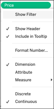
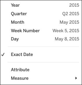
The same is true with the date. Pick the exact date so it won’t use the YEAR function, although it will still scale the chart so it’s easy to read. You can still pick year anyway, or year with month to be more specific.
Calculating correlation
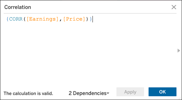
We calculate correlation by clicking Create Calculated field. The formula is below.
The curly braces {} means to make it a table calculation as opposed to running the calculation only against what is shown on the chart. That’s what we need to do, as Tableau automatically scales charts to make the data fit on the screen thus skipping over some data points.
These postings are my own and do not necessarily represent BMC's position, strategies, or opinion.
See an error or have a suggestion? Please let us know by emailing blogs@bmc.com.


