One good thing about Power BI is that when you add two tables to a dashboard they are synchronized.
So, when you click on one table, the linked table filters on that selected value. (It uses relationships between tables to do that, which we’ve previously explained.)
Let’s take a look at how this works.
(This article is part of our Power BI Guide. Use the right-hand menu to navigate.)
How to create linked tables
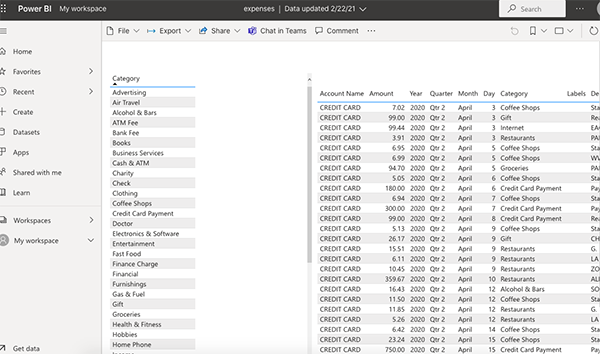
To illustrate, below is a report (dashboard) we want to make:
- On the left, we have transaction categories from our financial accounts
- On the right, transaction details.
The data is from the transactions.csv data file. (You can download your bank statement if you want to follow along.)
The data on the left is categories. The data on the right are transactions.
To put this in terms of SQL, the data on the left is basically the data:
select category, count(*) from transactions
The data on the right is:
Select * from transactions
We use the relationship wizard in Power BI to join them on the common element category. Then when we put two tables on the dashboard, Power BI uses this relationship to let us drill into the tables by category. In other words, we can see all our office expenses, advertising expenses, travel expenses, etc.
This is what the report looks like when we publish it to powerbi.com:
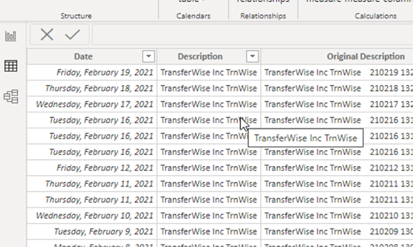
This is what the transaction detail data looks like:
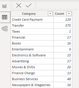
Group by category
Here are the categories. To make this view of the data we add data the data source transactions.csv a second time, then we dropped all the columns except category. Then we pick group by category.
Now, pick the table visualization and the fields. For the category table we obviously just pick one field, category.
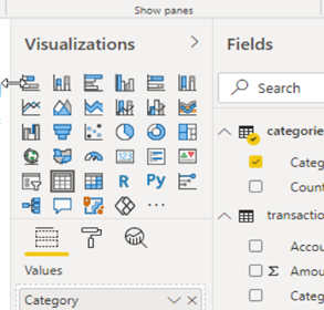
For the transactions table we pick all the transactions fields. Under fields we have the two data sources:
- Categories
- Transactions
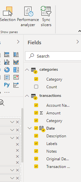
Resizing the dashboard
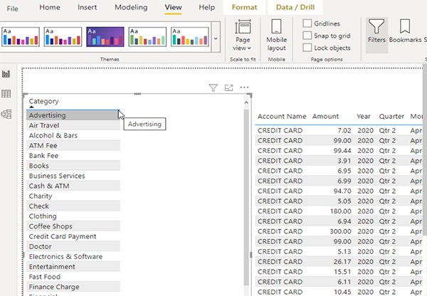
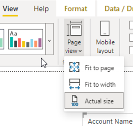
Here is what the tables look like when put onto the dashboard. The table and table text are too small and not positioned in the right place when we start. So, grab the edges to move them around and then go to Page View/Actual Size to make them large enough to read.
Viewing relationships
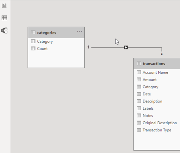
Here is the relationship screen. We don’t have to do anything as power BI matches by the common element, category.
When designing the table, before we publish it to powerbi.com, we can test it. We cannot see the layout very well, meaning the full screen size or mobile layout.
But we can click on the category on the left. Then the table on the right updates to show only transactions in that selected category. You could call this synchronized tables.
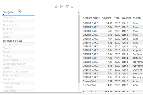
Viewing full-size
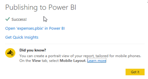
As always, click Publish to Power BI to test the final version. And as we just said, it’s really the only way to see the full-sized screen as Power BI Desktop does not have a very good preview function.
Related reading
- BMC Machine Learning & Big Data Blog
- Power BI Basics: Creating a Pie Chart with Power Query Editor
- Data Visualization Guide, a series of tutorials
- Data Storage Explained: Data Lake vs Warehouse vs Database
- Enabling the Citizen Data Scientists
- MySQL vs MongoDB: Comparing Databases
These postings are my own and do not necessarily represent BMC's position, strategies, or opinion.
See an error or have a suggestion? Please let us know by emailing blogs@bmc.com.


