
In this tutorial, we’ll show you how to create a pie chart using Microsoft Power BI for desktop. We’ll load some sample data from a .csv file then apply various transformation steps using the Power Query Editor.
(This article is part of our Power BI Guide. Use the right-hand menu to navigate.)
What’s Power BI?
Microsoft Power BI is a business and data analytics service. Its goal is to provide interactive data visualizations and business intelligence (hence the BI) in a simple interface so that anyone can use—from data experts to people who just need the insight.
Power BI has two main options, desktop and SaaS, both of which are free to use on a small scale.
To create dashboards, you’ll need to use the desktop option; the free SaaS option doesn’t have that function. So, you’ll create your dashboards locally, on your machine, then upload them for your users.
Download and install the desktop version, if you don’t already have it. Importantly, Power BI runs only on Windows.
Transform data
Download any kind of financial data if you want to walk through this exercise step-by-step. Or just read through it—the tutorial is short and uncomplicated.
We will use some expense data from a debit card. We need to:
- Filter out positive numbers. (We want only expenses, not payments.)
- Split the text by the delimiter issued by to extract the vendor name from description.
- Sum expenses by vendor.
Create a new Power BI report
Open Power BI Desktop and create a new report. (A better name might be dashboard. Microsoft uses both terms.)
Add a data source and import a .csv file. Instead of pressing the Load button, though, press Transform. That launches the Power Query Editor, which lets you filter, parse, and convert data.
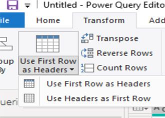
If you use a .csv file with headers select Use First Row as Headers:
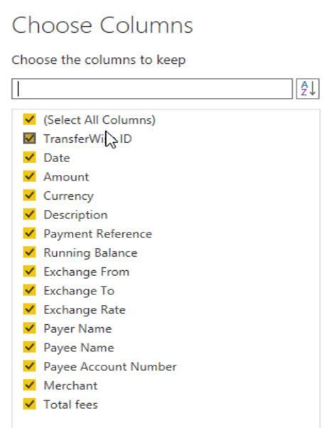
Choose columns
The data that we’re using has columns that we don’t need. You can remove those here:
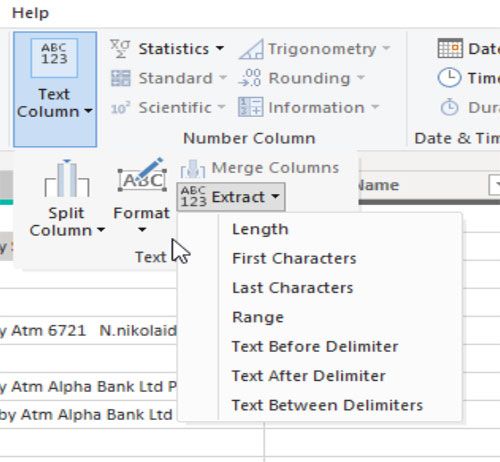
Now, the data we have does not have any categories and the vendor name is buried in transaction id issued by vendor name.
So, let’s use the text column function to extract the text after the delimiter issued by. This is simpler than having to handwrite a formula, as you would, for example, in Excel. (The Power Query Editor also works in Excel.)
Enter the delimiter text:
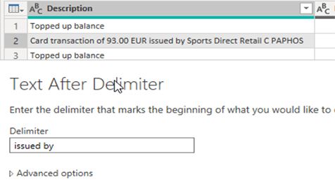
Power BI will replace the description column and not create a new one. That is a nice feature. If you were using Excel, for example, it would put the results in a new column. So, Power BI saves a step.
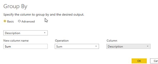
Group by description
Now we’ll sum the amount by vendor.
First, let’s make a mistake on purpose—so we can learn how to undo it. Select Group by and replace count with sum and pick the column description. Of course, it makes no sense to sum a text field, but do that to create an error.
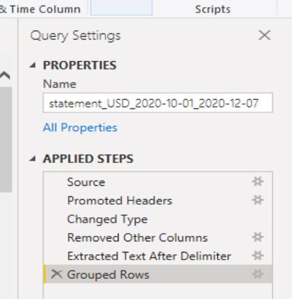
Undo & fix error
This is a nice feature in Power BI. There is no undo button—there’s something better. Power BI keeps track of each step on the right-hand side of the screen. Simply delete the last Applied Step and it undoes our mistake.
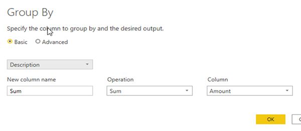
Now fix it by selecting Group by again, but this time select column amount.
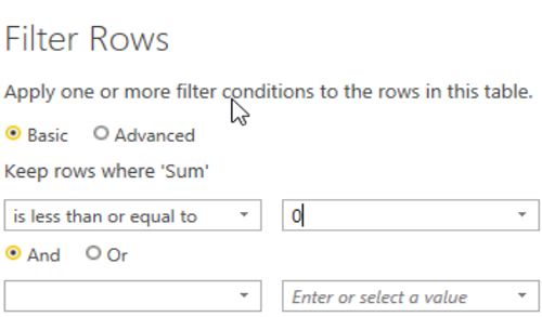
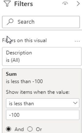
Filter positive values
Amounts bigger than 0 are payments. Amounts less than 0 are expenses. We want only expenses, so apply this filter. It does not ask which column since we’ve already done a Group by amount, we only have one sum column.
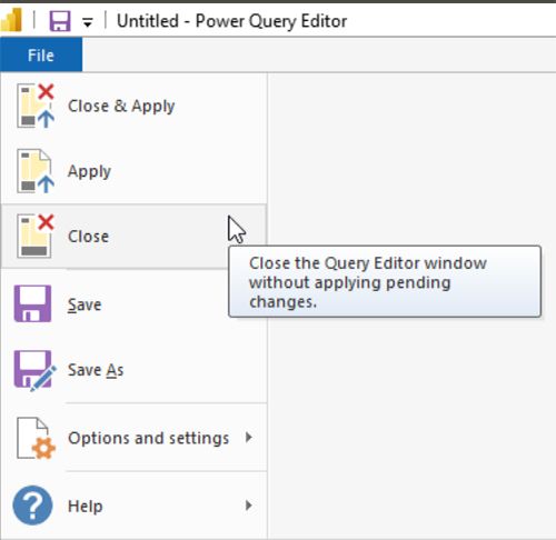
Now close and apply.
When we load the data into a visualization we will see that it is too crowded with too many vendors. So, we can filter again and drop any vendors whose expenses are less than 100.
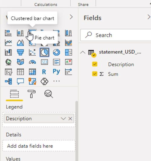
And now, you can create a visualization by picking it and the columns to go on the visualization. You could switch the x-y axes in the case of a bar or scatter chart. With Power BI, you can’t do anything illogical, such as picking four columns in a chart that only supports three.
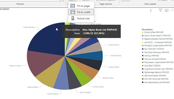
Here is our pie chart. The resolution is not good, unfortunately, which I think is a drawback of Power BI.
To view it a little better, click the filter, visualization, and fields tab to move those out of the way. Then click fit to width to get a better view of the chart. It’s probably small as Power BI is designed to have multiple charts on one dashboard.
That concludes this Power BI tutorial.
Related reading
- BMC Machine Learning & Big Data Blog
- Data Visualization Guide, a series of tutorials
- Data Storage Explained: Data Lake vs Warehouse vs Database
- Enabling the Citizen Data Scientists
- MySQL vs MongoDB: Comparing Databases
These postings are my own and do not necessarily represent BMC's position, strategies, or opinion.
See an error or have a suggestion? Please let us know by emailing blogs@bmc.com.