
Keras can be used to build a neural network to solve a classification problem. In this article, we will:
- Describe Keras and why you should use it instead of TensorFlow
- Explain perceptrons in a neural network
- Illustrate how to use Keras to solve a Binary Classification problem
For some of this code, we draw on insights from a blog post at DataCamp by Karlijn Willems.
(This tutorial is part of our Guide to Machine Learning with TensorFlow & Keras. Use the right-hand menu to navigate.)
What is Keras?
Keras is an API that sits on top of Google’s TensorFlow, Microsoft Cognitive Toolkit (CNTK), and other machine learning frameworks. The goal is to have a single API to work with all of those and to make that work easier.
In my view, you should always use Keras instead of TensorFlow as Keras is far simpler and therefore you’re less prone to make models with the wrong conclusions. Too many people dive in and start using TensorFlow, struggling to make it work. Keras adds simplicity. But you can use TensorFlow functions directly with Keras, and you can expand Keras by writing your own functions.
Keras prerequisites
In order to run through the example below, you must have Zeppelin installed as well as these Python packages:
- TensorFlow
- Keras
- Theano
- Seaborn
- Matplotlib
- NumPy
- pydot
- scikit-learn
You’ll also need this package:
- sudo apt install install graphviz
The data
First, we use this data set from Kaggle which tracks diabetes in Pima Native Americans. We use it to build a predictive model of how likely someone is to get or have diabetes given their age, body mass index, glucose and insulin levels, skin thickness, etc.
The code below plugs these features (glucode, BMI, etc.) and labels (the single value yes [1] or no [0]) into a Keras neural network to build a model that with about 80% accuracy can predict whether someone has or will get Type II diabetes.
Neural network
Here we are going to build a multi-layer perceptron. This is also known as a feed-forward neural network. That’s opposed to fancier ones that can make more than one pass through the network in an attempt to boost the accuracy of the model.
If the neural network had just one layer, then it would just be a logistic regression model.
You can still think of this as a logistic regression model, but one having a higher degree of accuracy by running logistic regression calculations multiple times. That’s the basic idea behind the neural network: calculate, test, calculate again, test again, and repeat until an optimal solution is found. This approach works for handwriting, facial recognition, and predicting diabetes.
Neural networks explained
You should have a basic understanding of the logic behind neural networks before you study the code below. Here is a quick review; you’ll need a basic understanding of linear algebra to follow the discussion.
Basically, a neural network is a connected graph of perceptrons. Each perceptron is just a function. In a classification problem, its outcome is the same as the labels in the classification problem. For this model it is 0 or 1. For handwriting recognition, the outcome would be the letters in the alphabet.
Each perceptron makes a calculation and hands that off to the next perceptron. This calculation is really a probability. In the case of a classification problem a threshold t is arbitrarily set such that if the probability of event x is > t then the result it 1 (true) otherwise false (0). For logistic regression, that threshold is 50%.
The functions used are a sigmoid function, meaning a curve, like a sine wave, that varies between two known values. The logistic sigmoid function works well in this example since we are trying to predict whether someone has or will get diabetes (1) or not (0).
A neural network is just a large linear or logistic regression problem
Logistic regression is closely related to linear regression. The only difference is logistic regression outputs a discrete outcome and linear regression outputs a real number. In fact, if we have a linear model y = wx + b and let t = y then the logistic function is.
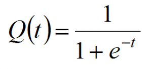
It’s a number that’s designed to range between 1 and 0, so it works well for probability calculations.
In the simple linear equation y = mx + b we are working with only on variable, x. You can solve that problem using Microsoft Excel or Google Sheets. You don’t need a neural network for that.
In most problems we face in the real world, we are dealing with many variables. In that case m and x are matrices. But the math is similar because we still have the concept of weights and bias in mx +b.
In the formula below, the matrix is size m x 1 below. So it’s a vector, which is a one-dimensional matrix. Each of i= 1, 2, 3, …, m weights is wi. And there are m features (x) x1, x2, x3, …, xm. x is BMI; glucose, etc. in the diabetes data. The weights w1, w2, …, wm and the bias is the number that most accurately predicts the relationship between those indicators and the probability that the person is diabetic.
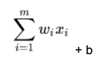
For each node in the neural network, we calculate the dot product of w • x, which means multiple every weight w by every feature x taken from our training set, and then add a bias b to shift the calculation up or down.
The expanded calculation looks like this, where you take every element from vector w and multiple it by its corresponding element in vector x.
f(x) = (w1* x1 + w2 * x2 + … + wm * xm) + b.
This gives us a real number. In the case of the logistic function, as we said above, it f(x) > %50 then the perceptron outputs 1. Otherwise 0.
Solving the neural network problem
The algorithm stops when the model converges, meaning when the error reaches the minimum possible value. In plain English, that means we have built a model with a certain degree of accuracy. The error is the value error = 1 – (number of times the model is correct) / (number of observations).
A mathematician would say the model converges when we have found a hyperplane that separates each point in this m dimensional space (since there are m input variables) with maximum distance between the plane and the points in space. Each of the positive outcomes is on one side of the hyperplane and each of the negative outcomes is on the other. In other words, it’s like calculating the LSE (least squares error) in a simple linear regression problem, except this is working in more than one dimension.
If no such hyperplane exists, then there is no solution to the problem. Then we conclude that a model cannot be built because there is not enough correlation between the variables.
Neural network layers
Remember that the approach to solving such a problem is iterative. In terms of a neural network, you can see this in this graphic below.
 Source: Wikipedia
We have an input layer, which is where we feed our matrix of features and labels. Those perceptron functions then calculate an initial set of weights and hand off to any number of hidden layers. How many times it does this is governed by the parameters you pass to the algorithms, the algorithm you pick for the loss and activation function, and the number of nodes that you allow the network to use.
The final solution comes out in the output later. There’s just one input and output layer. There’s no scientific way to determine how many hidden layers you should use. The data scientist just varies those and the algorithms used at each layer until the most accurate solution is found. So it’s trial and error.
The code
We have stored the code for this example in a Jupyter notebook here.
Seaborn correlation plot
A first step in data analysis should be plotting as it is easier to see if we can discern any pattern.
We could start by looking to see if there is some correlation between variables. So, we use the powerful Seaborn correlation plot. Seaborn is an extension to matplotlib.
First load the data into a dataframe:
import tensorflow as tf
from keras.models import Sequential
import pandas as pd
from keras.layers import Dense
data = pd.read_csv('/home/ubuntu/Downloads/diabetes.csv', delimiter=',')
Then visually inspect it:


First let’s browse the data, listing maximum and minimum and average values
data.describe()
Pregnancies Glucose BloodPressure SkinThickness Insulin \
count 768.000000 768.000000 768.000000 768.000000 768.000000
mean 3.845052 120.894531 69.105469 20.536458 79.799479
std 3.369578 31.972618 19.355807 15.952218 115.244002
min 0.000000 0.000000 0.000000 0.000000 0.000000
25% 1.000000 99.000000 62.000000 0.000000 0.000000
50% 3.000000 117.000000 72.000000 23.000000 30.500000
75% 6.000000 140.250000 80.000000 32.000000 127.250000
max 17.000000 199.000000 122.000000 99.000000 846.000000
BMI DiabetesPedigreeFunction Age Outcome \
count 768.000000 768.000000 768.000000 768.000000
mean 31.992578 0.471876 33.240885 0.348958
std 7.884160 0.331329 11.760232 0.476951
min 0.000000 0.078000 21.000000 0.000000
25% 27.300000 0.243750 24.000000 0.000000
50% 32.000000 0.372500 29.000000 0.000000
75% 36.600000 0.626250 41.000000 1.000000
max 67.100000 2.420000 81.000000 1.000000
prediction
count 768.000000
mean 0.317708
std 0.465889
min 0.000000
25% 0.000000
50% 0.000000
75% 1.000000
max 1.000000
FINISHED
You can also inspect the values in the dataframe like this:
data.info()
<class 'pandas.core.frame.DataFrame'>
RangeIndex: 768 entries, 0 to 767
Data columns (total 9 columns):
Pregnancies                 768 non-null int64
Glucose                     768 non-null int64
BloodPressure               768 non-null int64
SkinThickness               768 non-null int64
Insulin                     768 non-null int64
BMI                         768 non-null float64
DiabetesPedigreeFunction    768 non-null float64
Age                         768 non-null int64
Outcome                     768 non-null int64
dtypes: float64(2), int64(7)
memory usage: 54.1 KB
Check correlation with heatmap graph
Next, run this code to see any correlation between variables. That is not important for the final model but is useful to gain further insight into the data.
Seaborn creates a heatmap-type chart, plotting each value from the dataset against itself and every other value. Then it figures out if these two values are in any way correlated with each other.
import seaborn as sns
import matplotlib as plt
corr = data.corr()
sns.heatmap(corr,
xticklabels=corr.columns.values,
yticklabels=corr.columns.values)
Items that are perfectly correlated have correlation value 1. Obviously, every metric is perfectly correlated with itself., illustrated by the tan line going diagonally across the middle of the chart.

There’s not a lot of orange squares in the chart. So, you can say that no single value is 80% likely to give you diabetes (outcome). There does not seem to be much correlation between these individual variables. But, we will see that when taken in the aggregate we can predict with almost 75% accuracy who will develop diabetes given all of these factors together.
You can check the correlation between two variables in a dataframe like shown below. There is not much correlation here since 0.28 and 0.54 are far from 1.00.
data['BloodPressure'].corr( data["BMI"])
0.2818052888499106
data["Pregnancies"].corr(data["Age"])
0.5443412284023394
Prepare the test and training data sets
- Outcome is the column with the label (0 or 1).
- The rest of the columns are the features.
- We use the scikit-learn function train_test_split(X, y, test_size=0.33, random_state=42) to split the data into training and test data sets, given 33% of the records to the test data set. The training data set is used to train the mode, meaning find the weights and biases. The test data set is used to check its accuracy.
- labels is not an array. It is a column in a dataset. So we use the NumPy np.ravel() function to convert that to an array.
import numpy as np
labels=data['Outcome']
features = data.iloc[:,0:8]
from sklearn.model_selection import train_test_split
X=features
y=np.ravel(labels)
X_train, X_test, y_train, y_test = train_test_split(X, y, test_size=0.33, random_state=42)
Now we normalize the values, meaning take each x in the training and test data set and calculate (x – μ) / δ, or the distance from the mean (μ) divided by the standard deviation (δ). That put the data on a standard scale, which is a standard practice with machine learning.
StandardScaler does this in two steps: fit() and transform().
from sklearn.preprocessing import StandardScaler
scaler = StandardScaler().fit(X_train)
X_train = scaler.transform(X_train)
X_test = scaler.transform(X_test)
The Keras sequential model
The code below created a Keras sequential model, which means building up the layers in the neural network by adding them one at a time, as opposed to other techniques and neural network types.
Activation function
Pick an activation function for each layer. It takes that ((w • x) + b) and calculates a probability. Then it sets a threshold to determine whether the neuron ((w • x) + b) should be 1 (true) or (0) negative. (That’s not the same as saying diabetic, 1, or not, 0, as neural networks can handle problems with more than just two discrete outcomes.)
For the first two layers we use a relu (rectified linear unit) activation function. That choice means nothing, as you could have picked sigmoid. reluI is 1 for all positive values and 0 for all negative ones. So:
f(x) = 0 if x <=0
f(x) = 1 if x > 0
This is the same as saying f(x) = max (0, x). So f(-1), for example = max(0, -1) = 0. In other words, if our probability function is negative, then pick 0 (false). Otherwise pick 1 (true).
The rule as to which activation function to pick is trial and error. Pick different ones and see which produces the most accurate predictions. There are others: Sigmoid, tanh, Softmax, ReLU, and Leaky ReLU. Some are more suitable to multiple rather than binary outputs.
Sigmoid uses the logistic function, 1 / (1 + e**z) where z = f(x) = ((w • x) + b).
This graph from Beyond Data Science shows each function plotted as a curve.

Some notes on the code:
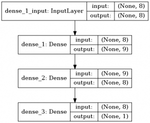
- input_shape—we only have to give it the shape (dimensions) of the input on the first layer. It’s (8,) since it’s a vector of 8 features. In other words its 8 x 1.
- Dense—to apply the activation function over ((w • x) + b). The first argument in the Dense function is the number of hidden units, a parameter that you can adjust to improve the accuracy of the model. Hidden units is, like the number of hidden layers, a complex topic not easy to understand or explain, but it’s one we can safely gloss over. (The complexity of these two topics is what makes most people say that working with neural networks is art. A mathematician would mock that lack of rigor.)
from keras.models import Sequential
from keras.layers import Dense
model = Sequential()
model.add(Dense(8, activation='relu', input_shape=(8,)))
model.add(Dense(8, activation='relu'))
model.add(Dense(1, activation='sigmoid'))
- loss—the goal of the neural network is to minimize the loss function, i.e., the difference between predicted and observed values. There are many functions we can use. We pick binary_crossentropy because our label data is binary (1) diabetic and (0) not diabetic.
- optimizer—we use the optimizer function sgd, Stochastic Gradient Descent. It’s an algorithm designed to minimize the loss function in the quickest way possible. There are others.
- epoch—means how many times to run the model. Remember that it is an iterative process. You could add additional epochs, but the accuracy might not change much. You just have to try and see.
- metrics—means what metrics to display as it runs. Accuracy means how accurately the evolving model predicts the outcome.
- batch size—n means divide the input data into n batches and process each in parallel.
- fit()—trains the model, meaning calculates the weights, biases, number of layers, etc.
model.compile(loss='binary_crossentropy',
optimizer='sgd',
metrics=['accuracy'])
model.fit(X_train, y_train,epochs=4, batch_size=1, verbose=1)
Above, we talked about the iterative process of solving a neural network for weights and bias. That’s done with epochs. Here is the output as it runs those. As you can see the accuracy goes up quickly then levels off.
Epoch 1/4
514/514 [==============================] - 2s 3ms/step - loss: 0.6016 - acc: 0.6790
Epoch 2/4
514/514 [==============================] - 1s 1ms/step - loss: 0.5118 - acc: 0.7588
Epoch 3/4
514/514 [==============================] - 1s 1ms/step - loss: 0.4755 - acc: 0.7782
Epoch 4/4
514/514 [==============================] - 1s 1ms/step - loss: 0.4597 - acc: 0.7802
You can use model.summary() to print some information.
Here are the weights for each layer we mentions.
for layer in model.layers:
weights = layer.get_weights()
It looks like this:
[array([[ 0.11246287,  0.64353085,  0.00519296, -0.3992814 ,  0.29071185,
0.3010074 ,  0.21385622,  0.31609035],
[ 0.6338699 ,  0.5349119 ,  0.11174025,
…
We can also draw a picture of the layers and their shapes. It’s not very useful but nice to see.
from keras.utils import plot_model
plot_model(model, to_file='/tmp/model.png', show_shapes=True,)
As you would expect, the shape of the output is 1, as there we have our prediction:
Then we can get configuration information on each layer with layer.get_config and the model with model.get_config():
Now we can run predictions on test data.
y_pred = model.predict_classes(X_test)
This prints the score, or accuracy.
score = model.evaluate(X_test, y_test,verbose=1)
print(score)
254/254 [==============================] - 0s 46us/step
[0.5745944582571195, 0.7204724428221936]
So, our predictive model is 72% accurate.
If you read the discussions at data camp you can see other analysts have been able to get slightly better results trying other techniques. But remember the danger of overfitting.
These postings are my own and do not necessarily represent BMC's position, strategies, or opinion.
See an error or have a suggestion? Please let us know by emailing blogs@bmc.com.