
This post is the beginning of an in-depth series on Tableau—I’ll start with an introduction and a real-world example. Tableau is a charting system for presenting data in an easy-to-read format. It can help you better understand your data, so you can quickly put clear insights to work. Tableau also illustrates your data in a variety of ways, so you can perfectly present your data to others. Think of it as an important tool in your business analytics toolkit.
Tableau has multiple out-of-the-box charting options. In this article, we’ll look at:
- Bar charts
- Pie charts
- Packed bubbles chart
- Box and whisker plot
(This article is part of our Tableau Online Guide. Use the right-hand menu to navigate.)
What is Tableau?
If you’ve never used Tableau, I like to explain it this way: Think of Microsoft Excel on steroids, with the power of larger and more complicated analytics packages like SAS, but without some of the complexity.
Tableau reduces the need for programming so that the layman can write custom statistics and ML functions. Tableau is intended for a wide variety of users from data analysts and data scientists to any business unit that may need quick, customizable data—especially if they aren’t data specialists.
(Certainly, more advanced projects and skillsets, like analysts and scientists, can use more sophisticated data visualization tools, like Matplotlib and Python. See more in our Data Visualization Guide.)
Tableau is a market leader
Tableau has long had a significant market share in the analytics software market. In August 2019, Salesforce acquired Tableau, kicking off a big marketing push for the product. Tableau now also takes advantage of Salesforce AI tools, like Salesforce Einstein Analytics, which is included in Tableau.
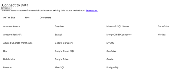
To use Tableau, you do not need to be a Salesforce user. Quite the contrary. Tableau’s strength is how it can work with so many data sources, including Microsoft Excel (thus Google Sheets), ordinary text files, JSON, Spatial files, etc., and those in the graphic below:
Use case: Chase Bank credit statement
Let’s show how you can use Tableau with a real-world example. (Note: you can sign up for a free 14-day trial of Tableau Online, the cloud version, which this example utilizes.)
Uploading your data
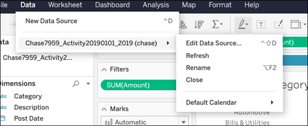
It’s a simple matter to upload a spreadsheet to Tableau. In this example, we’ll use a bank statement. First, download your bank statement data. If it’s in .csv format, use Google Sheets or Microsoft Excel to convert it to .xls format. Next, click the data source table and upload it to Tableau.
From here, Tableau makes things fairly easy—by anticipating what is logical. For example, it would not make sense to plot individual transactions by category, as the resulting chart would be too wide and busy. Instead, it calculates the sum. So, it shows expenses by category when we pick those two data points.
Bar chart
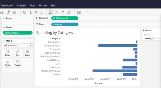
Let’s start with a bar chart, which is easy to understand. To make the chart, drag and drop fields on the left to the right or into the row and column fields. It would make sense to put sum(amount) on the rows and categories on the column. Then, Tableau generates a bar chart. (At this point, don’t enter more than two values. That would create a 3D chart, which Tableau can do, but it is a more advanced topic.)
Here is the Tableau palette where you work:
Notice in the Amount field we have adjusted for only negative numbers to exclude credit card payments, which are positive. Including that would squish the other rows down, thus making them harder to read, as most transactions are payments.
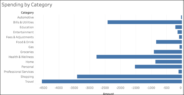
Here is a wider view of the chart:
Pie chart
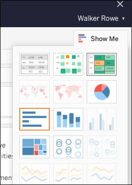
You can easily create pie charts in Tableau, too. To switch from the bar chart to the pie chart with the same data, click the Show Me button in the top right and select the pie chart.
Now we draw a pie chart. This shows the same information except in a circle, shaped like a pie. Each slice is calculated as (sum amount that category / sum all categories). Here, you can easily see that travel expenses are much larger than automotive.
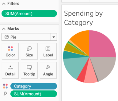
Notice that as you hover the mouse over the chart, it shows the details of that slice. That is an interactive feature.
(If Tableau won’t draw a chart then you then have more than two values (dimensions) so delete one of them. I say this because when I did this operation with Tableau writing this document. It added the sum(Amount) calculation twice on the marks tab.)
To add numbers to the slices, click the label button. You can format the amount in a few ways, such as writing negative numbers with () as in the accounting format, or dropping decimal points.
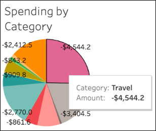
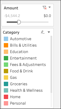
Notice this legend which shows the categories. Below in the Amount box is the filter. Since payments are negative, we pick amounts whose maximum value is 0, i.e., <= 0.
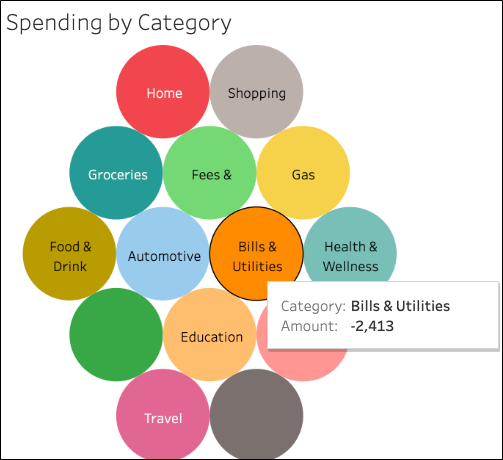
Packed bubbles chart
This chart is called packed bubbles. All the bubbles are the same size. (The packed bubbles chart does not show the size as a relative measure of amount. That would be a heat map type of chart.)
Here, you also have the interactive feature of hovering the mouse to see details:
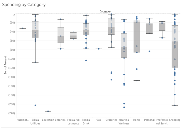
Box and whisker plot
This chart plots the box and whiskers of your data, which is an easy way of showing density and outliers—something these other beginner chart styles don’t indicate as easily.
Additional resources